SKATEBOARD SCOTLAND
Branding & Landing Page Case Study
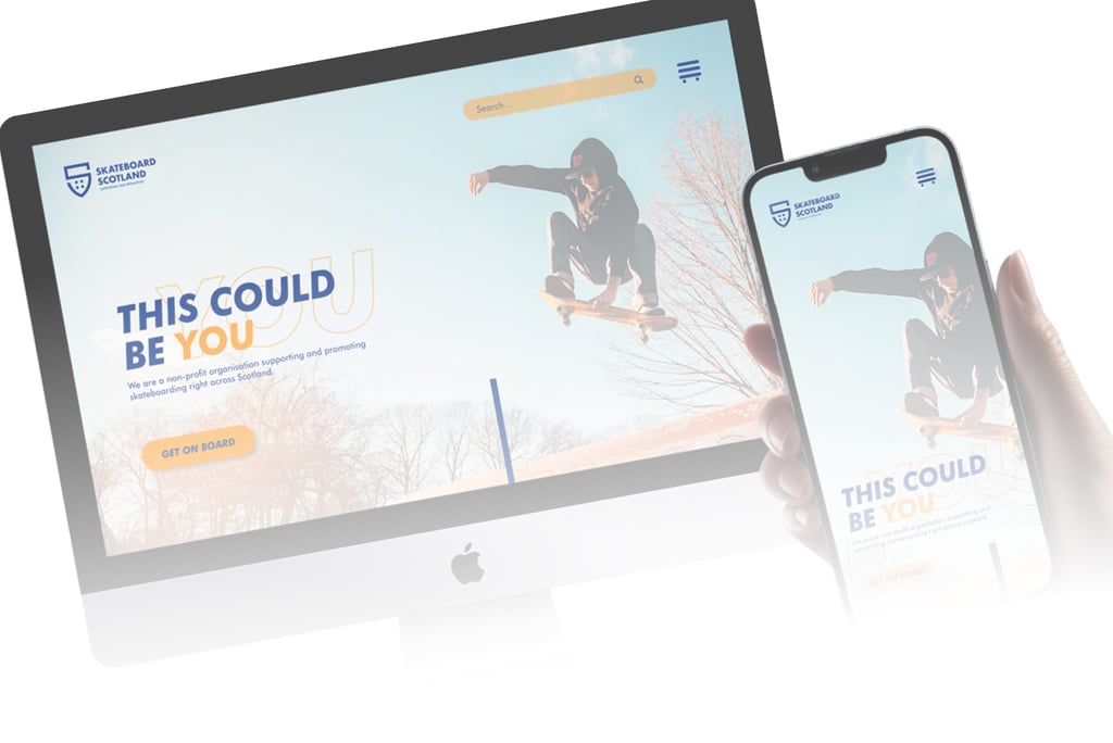
Skateboard Scotland: Revamping a Classic Sport’s Online Presence
The Challenge: A Stagnant Online Presence
Skateboard Scotland, a non-profit dedicated to the skateboarding community in Scotland, needed a major overhaul of their website. Their existing site lacked excitement and failed to engage the younger demographic, especially those aged 11-17, who are crucial to growing the skateboarding community.
The Creative Process: Bringing Energy and Engagement
To address the challenge, I collaborated with Skateboard Scotland to revamp their landing page. Here’s a summary of our approach:
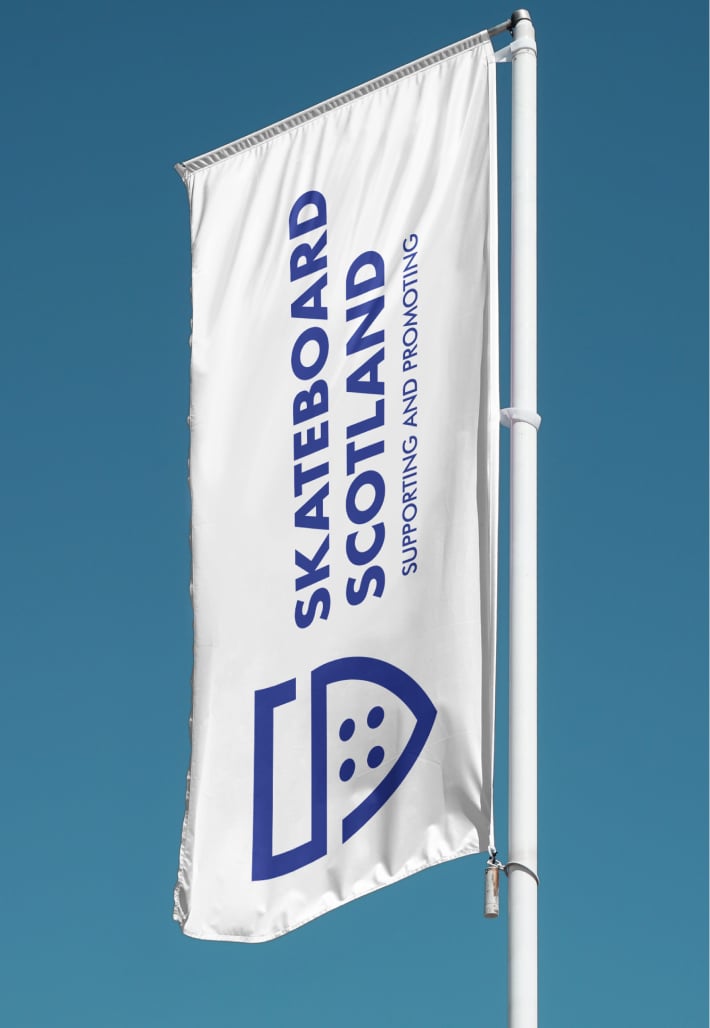
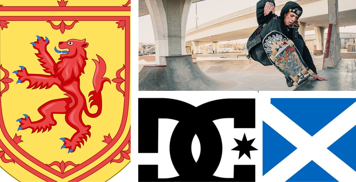
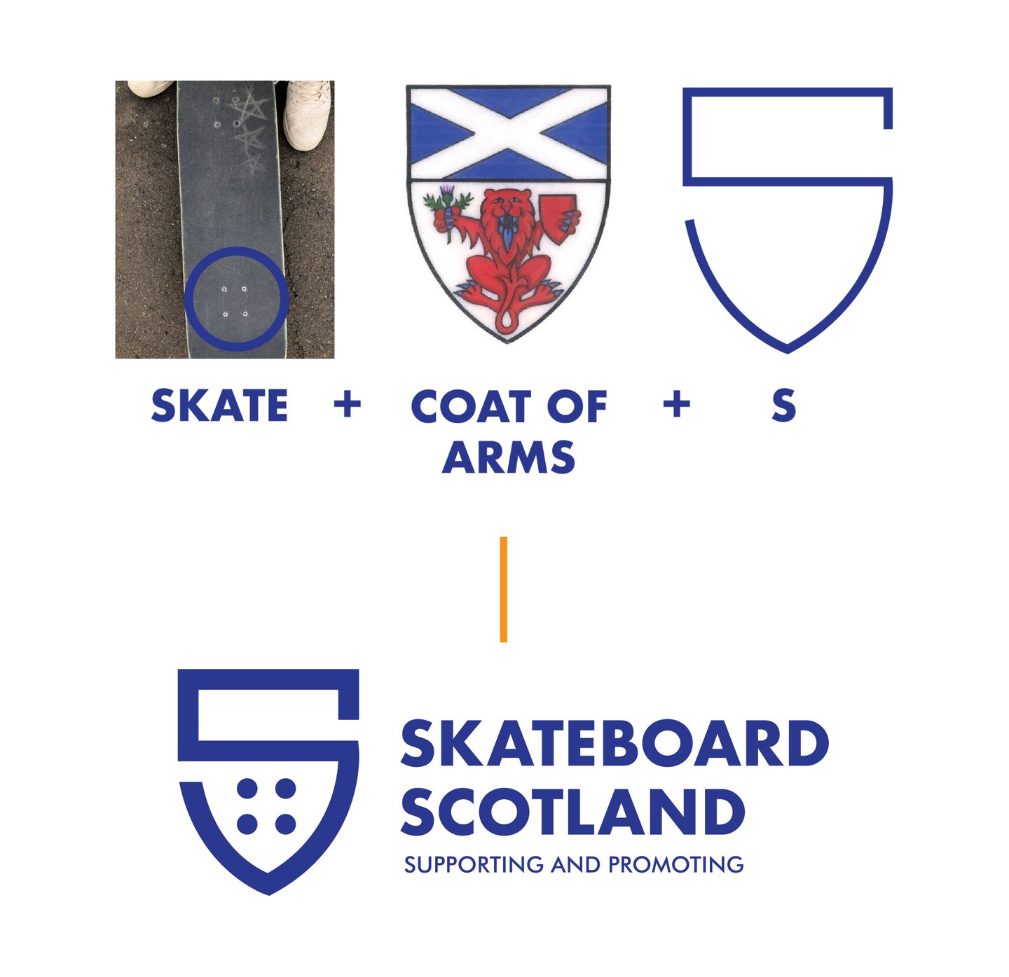
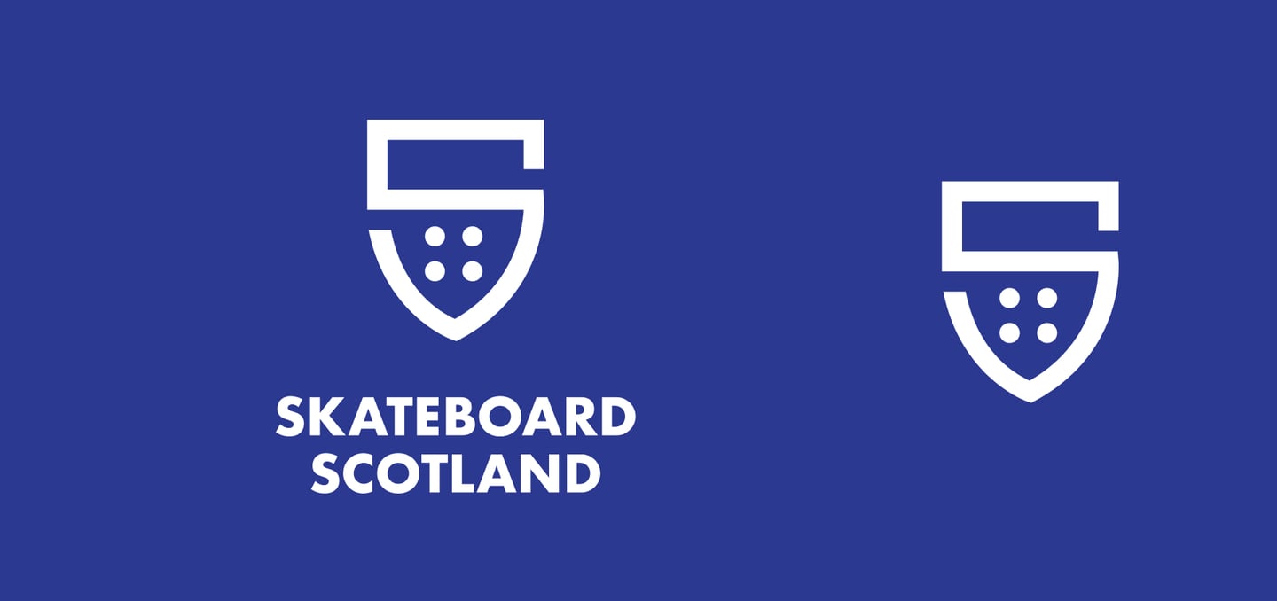
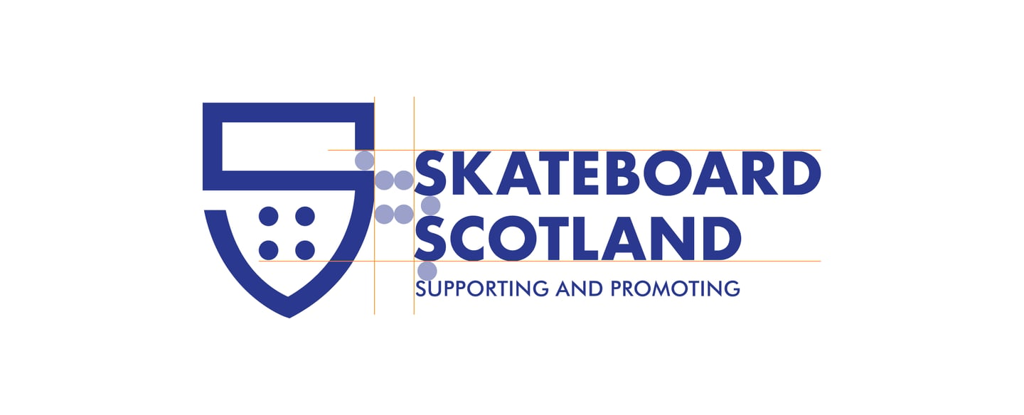
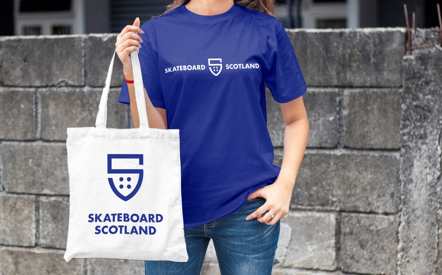
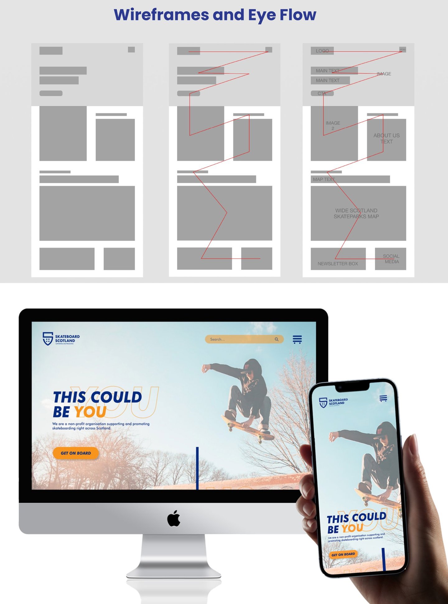
Logo and Brand Refresh: Updated the logo with new colors and design elements to reflect the dynamic nature of skateboarding.
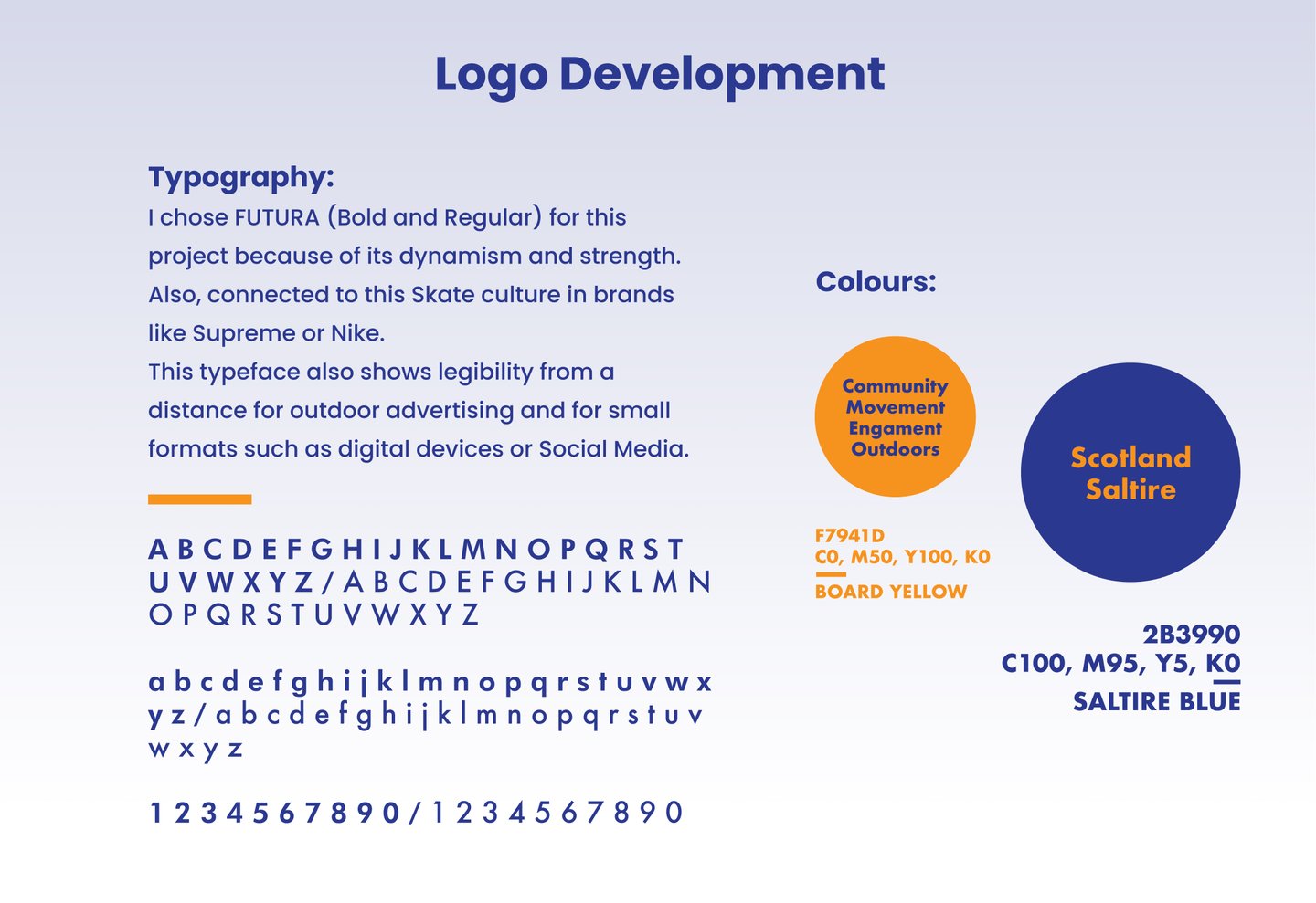
Vivid Color Palette: Introduced bold colors like bright oranges and deep blues to evoke the thrill of the sport.
Engaging Typography: Used modern, attention-grabbing fonts for better readability and excitement.
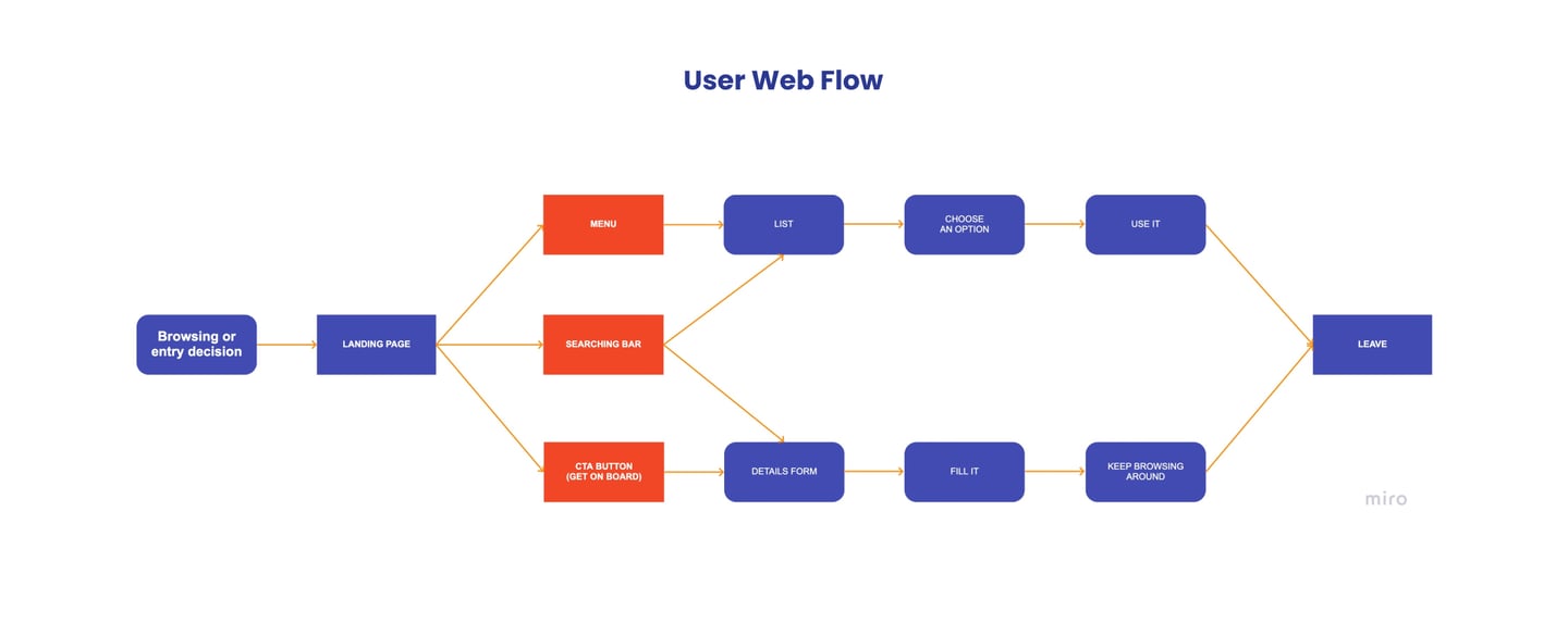
Interactive Features: Added dynamic sliders, animations, and vibrant call-to-action buttons to enhance user interaction.
Visual Storytelling: Showcased high-quality images and videos to capture the energy of skateboarding and encourage community involvement.Escribe tu texto aquí...
The Result: A Thrilling New Online Experience
The redesigned landing page of Skateboard Scotland has been a resounding success. The fresh visual identity and engaging design elements have transformed the website into a hub of excitement and information for both seasoned skateboarders and newcomers.
Key Outcomes:
Enhanced User Engagement: The new design features have led to increased interaction with the website. Visitors are more likely to explore events, sign up for memberships, and connect with the skateboarding community.
Appeal to Younger Audiences: The bold design choices and interactive elements have effectively captured the attention of the 11-17 age group. This demographic is now more excited about joining Skateboard Scotland and exploring what the community has to offer.
Strengthened Brand Identity: The updated logo, vibrant color palette, and modern typography have successfully revitalized the brand’s image, aligning it with the energetic and inclusive nature of skateboarding.
Increased Visibility: The visually captivating design has helped elevate Skateboard Scotland’s online presence, making it a go-to resource for information about skateboarding venues, events, and community support.
Conclusion
The project revitalized Skateboard Scotland’s website, making it a vibrant and engaging hub for skaters and enthusiasts. The successful redesign not only improved the site’s aesthetics and functionality but also helped meet Skateboard Scotland’s goals for community growth and visibility.


CONTACT ME
If you're interested in hearing more about the way I work, have a business proposal or want to say hello I'd love to hear from you.
